Table of contents
Logo
The OpenWidget logo should be used whenever possible to maintain brand recognition and consistency. Please refer to clear space, sizing, and usage on backgrounds guidelines for best practices.
The horizontal logo is the primary logo and should be used in most instances. The stacked logo is for large-scale use.
Download logo assets
Clear space
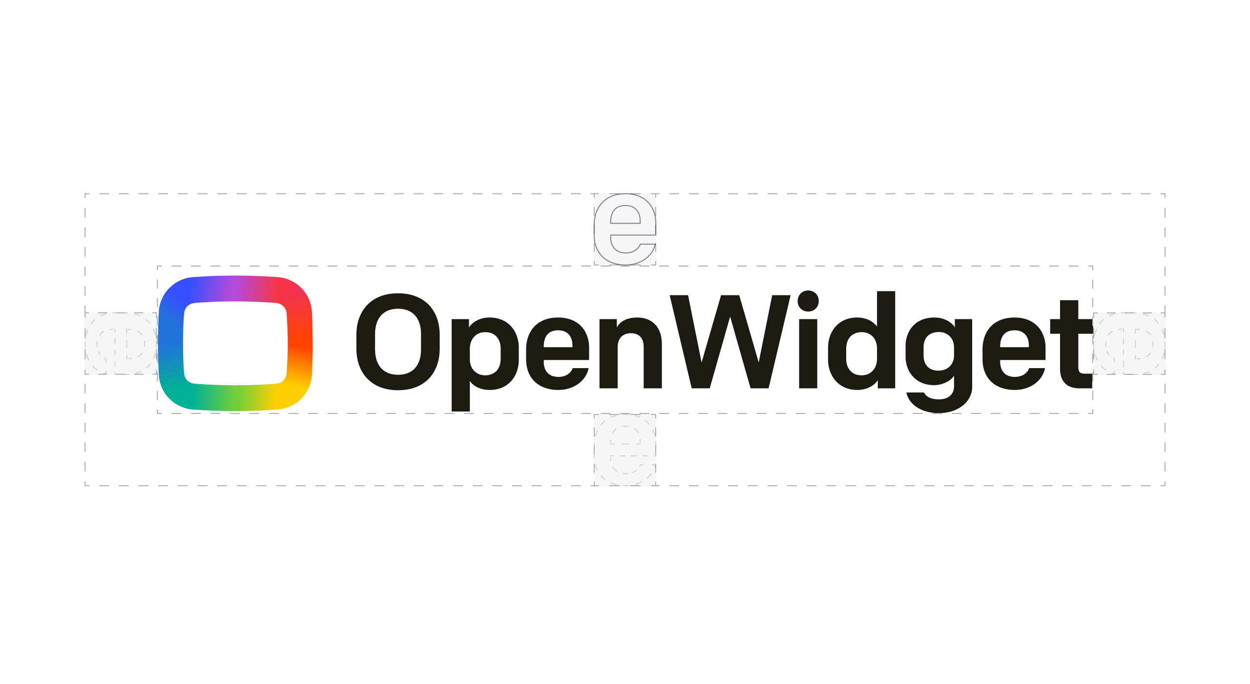
The OpenWidget logotype and symbol should always be surrounded by a minimum area of clearspace. This space ensures that headlines, text, and other elements do not encroach on our branding.
In most cases, it’s better to give the logo even more space, but just make sure it has a clear space of at least a letter "e".
Sizing
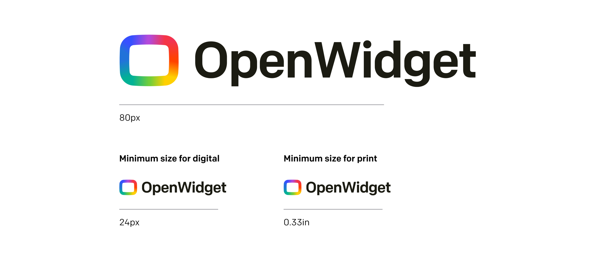
The minimum sizes vary for print and digital. Please refer to the corresponding guidelines and be mindful when using the logotype for different applications.
Usage on background
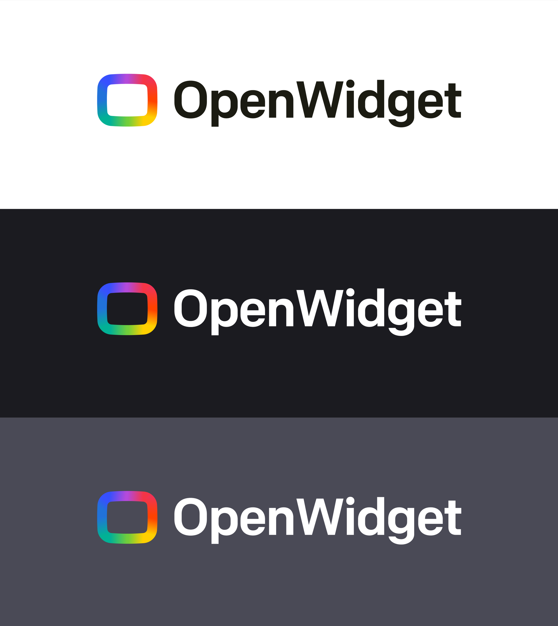
The full-color logos should be used only on white, black, or gray colored backgrounds. Avoid using full-color logos on photographs unless the logo sits on a black or white area of the image
Typography
Colfax
Our primary typeface, Colfax, is used for headlines, subheadlines, CTAs, and body text. It works equally well in print and digital applications. Please use Colfax in all communication material whenever possible.